Newflash: “click here” is not an effective call to action. In this growing digital world, consumers are more inundated than ever with marketing messages. To stick out, and to get those potential customers to do something, your call to actions need to be truly inspiring.
A good call to action is:
- Compelling — giving the reader a real reason to click
- Benefit-focused — telling the reader how they’ll benefit from the click
- Clear — telling the reader exactly what will happen when they click
If you’re struggling to write a CTA that works for your contact form or website, here are five call to action examples pulled from real websites that may help you.
1. Akismet
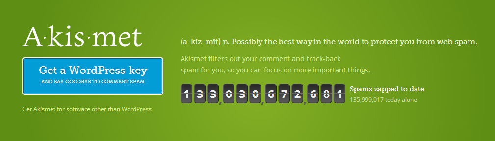
Akismet is a WordPress plugin that identifies spam in comments and prevents them from showing up on your blog. You may not think that such a popular and desired service would need a strong call to action, but it does. This is because using Akismet on WordPress requires generating a unique key, which takes a few minutes if you don’t already have a WordPress.com account.
To combat the potentially high abandon rate that comes with spending time on acquiring that key, Akismet’s CTA is extremely benefit-focused, promising you can “say goodbye to comment spam.” Also, the real-time counter on their website shows the number of spam comments blocked to date, and just on that day.
By highlighting the benefits of Akismet in a clear, easy-to-understand way before the user clicks, this service is ensuring that potential abandons are prevented. Ultimately, the benefits of Akismet will outweigh the inconvenience of signing up for a key.
2. Crazy Egg
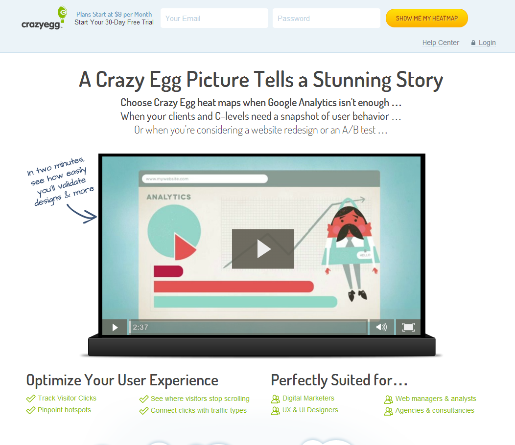
Crazy Egg is an analytics tool that allows website owners to create heatmaps of clicks and activity on their sites. The potential “barrier to entry” here is complication: new digital marketing managers or inexperienced website owners may think the software is way too difficult for them to use or figure out.
Crazy Egg combats this by offering a two minute video that shows how easy it is to generate heatmaps with their service. They also reassure readers that they are “perfectly suited” for a variety of positions. But the best part of this landing page is the actual call to action at the top: “show me my heatmap.” This clear CTA implies that you’ll receive instant results — no waiting around.
3. Spotify
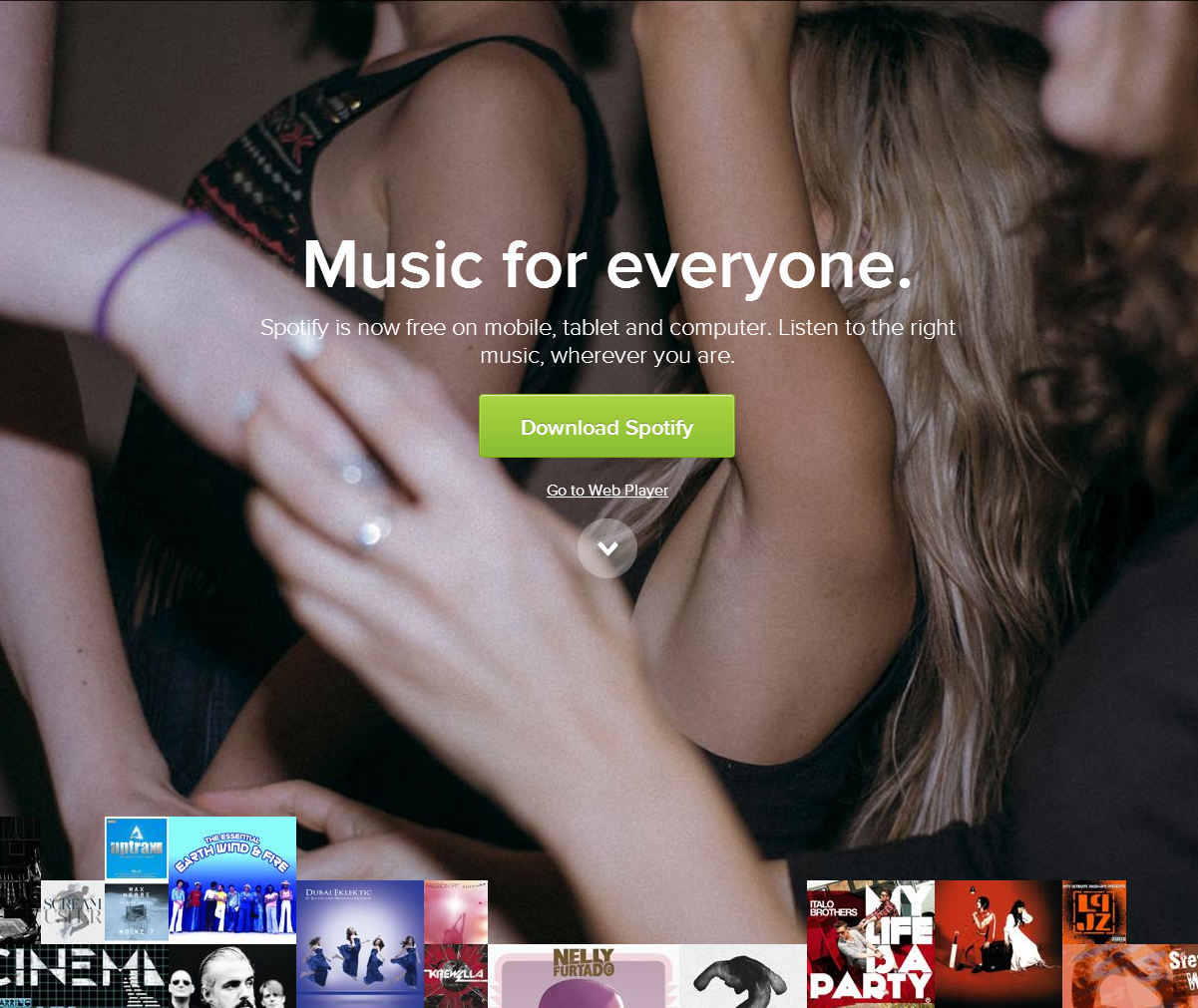
Spotify has an incredibly compelling offer: free music. But since the desired action for potential users — download their software — could be a little off-putting (who wants yet another app, anyway?), they make their service more desirable by sprinkling the homepage with popular and recent album covers that are sure to catch the attention of those who haven’t used the service before. The “oh, I can listen to that? For free?” reaction is exactly what they want. It’s all about the benefit to you, the user. Money isn’t discussed at all, even though Spotify does offer paid plans.
There’s also an additional benefit implied on the images that surround the “download” CTA. The image of people dancing or partying in the background seems to imply that those who use Spotify have more fun. This may not necessarily be true, but it works!
4. Firefox
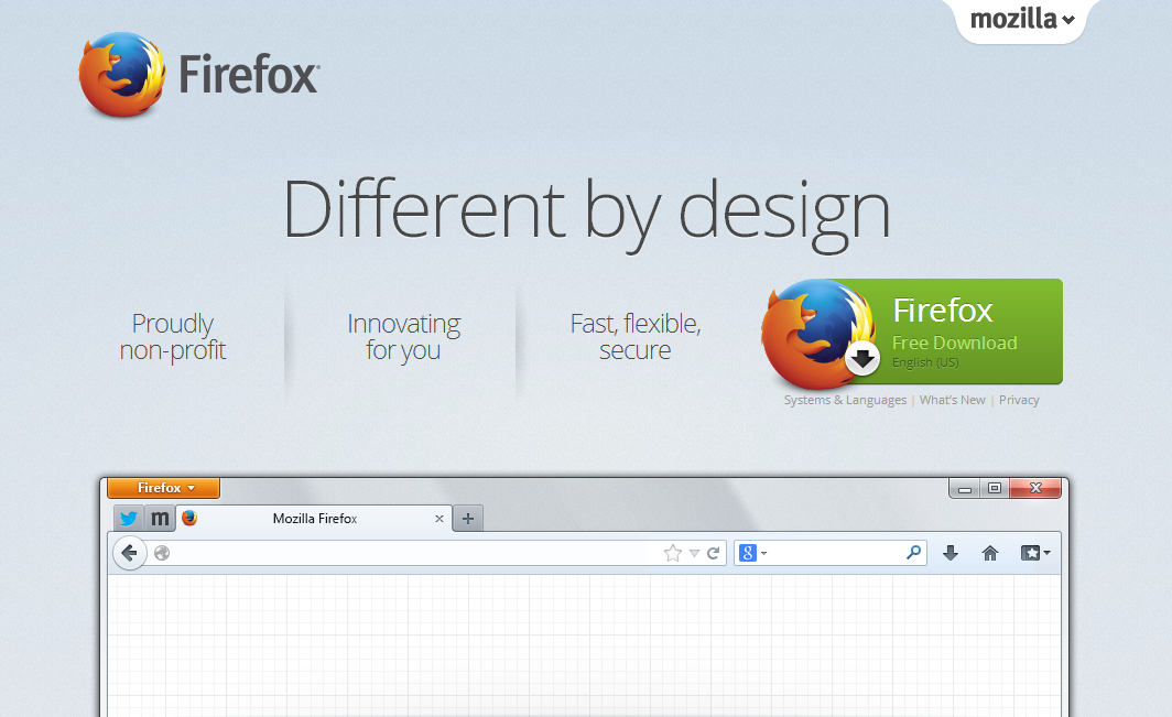
Firefox keeps its CTA simple, but that’s all it needs. For users who are tired of Internet Explorer or other browsers, Firefox clearly states its benefits: it’s non-profit, innovative, and fast. If you’re coming from a slow, unreliable, or outdated Internet browser, this is probably all you need to hear.
But one great touch here that absolutely should not be overlooked is the screencap of Firefox right below the call to action. So many people fear changing browsers simply because they don’t know what to expect. Firefox actually shows you! It’s almost as if they’re saying “see, it’s not so different, is it?” This helps eliminate the fear of the unknown.
5. Basecamp
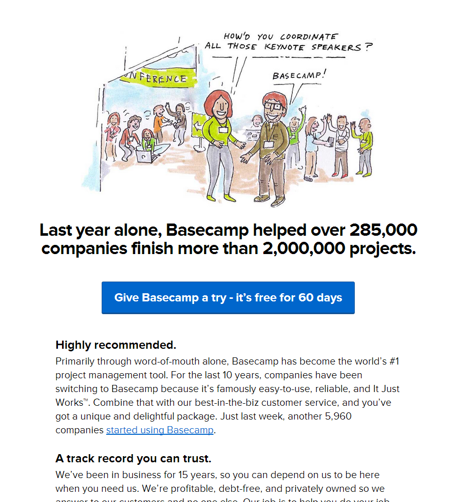
Basecamp has one of the most compelling CTAs on the web, and that’s because they put their results front and center. Their service helped 285,000 companies finish two million real projects. The cartoon helps illustrate this point (literally): a potentially complicated event was coordinated flawlessly by the use of the service. And who can say no to “free for 60 days”?
Basecamp actually has a second fantastic call to action in the top right hand corner of their site, where most services simply put a “log in” or “help” option. They have a “check out an example project” link there:

By letting potential users try Basecamp before they sign up or even start a free trial, the company is cutting back on the number of people who sign up, try it, and quickly abandon it. So they’re not only eliminating companies who won’t think Basecamp is “right” for them, but also giving people a chance to try it so they can decide it is the correct choice.
These are just five examples of some of the best calls to action on the web. If you need help writing a CTA that works, or copy that compels, contact Inbound Marketing Inc. today. We look forward to hearing from you!